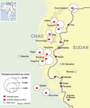
This (geo)graphic is Life Expectancy at Birth in Africa from 1960 – 2004 from UUorld Inc on Vimeo. My friend Willy Pell, the technology visionary behind UUorld Inc. (yes, www.world.com was taken), sent me the latest download of this supercool (and easy to use) application for loading and viewing (geo)statistical data. I was perusing the videos that demonstrate the application in action, and found this scary visualization of the cratering life expectancy rate in Africa. And, since the World Bank data in this demo ended in 2004, we can’t even watch the Darfur atrocities in overdrive. Speaking of Sudan, while the bubbling over of the Gaza situation is dominating the front page (now that the death toll has topped 900), Sudan is still getting column inches. But I really loved this dynamic timeline of the conflict in Darfur, published by Reuters. And, they have a nice map on the refugee camps over the border in Chad:
 Unfortunately, Reuter’s did not provide such a timeline for other countries around the world, to allow you to discover their reporting regarding different countries at any point in time. Sorry, but this is a sore point of mine. Why is it that news organizations can’t seem to publish their reporting to a map, so that I can quickly see how their reporting covers different parts of the world? We’ve been able to do this (technically) for a long time. Instead, I get to keyword search country name by country name. Gee thanks. I guess that I can pray for progress.
Speaking of praying, please read this article, which I found buried on the Reuters site:
Voodoo priests pray for Israel-Palestinian peace
Maybe Obama should have picked a Voodoo priest instead of Rick Warren for the Inaguration!