Category Archives: Mother Earth

Rethinking Ourselves and the “Other” Through Genographics

Screen Shot 2014-12-17 at 5.55.21 PM

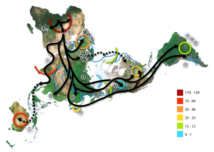
Last year, my brother got me a Geno 2.0 kit from National Geographic.  It took me a while to get around to it.  But, now that I have done it…  Coolest. Gift. Ever.  Particularly if you are a sucker for genetic anthropology, and a map freak to boot.  I mean, its one thing to spend tons of time hunting down different animated maps depicting mankind’s diaspora from Africa (like the National Geographic’s Global Human Journey; or Professor Stephen Oppenheimer’s “Journey of Mankind: The Peopling of the World” funded by the Bradshaw Foundation; or this not-so-animated Genetic Atlas of Human Admixture History; or this completely static World map of Y-chromosome haplogroups – really, why is this not animated!)  Its an entirely different thing to have your own mitochondrial DNA sequenced and plotted over time against these geographic haplogroup mappings.  See mine here.

Its fascinating.  I have long thought the concept of race was crap.  Growing up as a racist (oh, and sexist and homophobic) white southern male in the 1970s and 80s, it took me a while to get to that point in life.  But, getting the results of the Geno 2.0 kit made it very clear.  In my youth, my Scotch/Irish/British/WASP and pioneer-stock roots clearly imparted me special “caucasian” status, along the traditional racial lines of distinction that were culturally reinforced every day in “The South”.  Even as a fan of Charles Darwin and the Origin of Species, my youthful ignorance could not be eroded.  It wasn’t until the concepts of “genetic anthropology” and mitochondrial DNA were popularized that my small brain finally grasped that the variety of humanity (both genotypically and phenotypically) was more like different breeds of canines (though, even less material) than the tired concept of “race”.  And, that over the past 100,000 years, mankind had journeyed from its point of origin in eastern Africa to every corner of the Earth, adapting genetically and in physical appearance from time to time.  But, no.  These changes have manifested more as illusions obscuring the truth than anything truly meaningful.  Thanks, evolution.  Really helpful.

My maternal and paternal DNA map from the Geno 2.0 kit was eye opening.  As best as I can tell, Mom is kind of a Fertile Crescent girl, with a lot of her ancestor’s time spent in Western Asia, kind of at the intersection of Iran, Western Turkey, the Caucuses and the like, going back as far as 55,000 years.  Dad is more of an Egyptian. His ancestors stayed in Africa, mostly around current day Ethiopia, Sudan and Egypt until say 18,000 years ago, until his ancestors jumped the Mediterranean into the present day eastern Turkey and the Balkans.  (What is funny about this to me is that as a kid growing up in Central Florida, when the Mormons or Jehovah’s Witnesses would come by the house asking whether he had ever read the Bible, he would turn on his thick British colonial Trinadadian accent and say “I’m Muslim”, which would send them moving along pretty quickly.)

Interestingly, the major haplogroups that define their distant past (both mom and dad), going back 60,000 years are majorly different – even though in a modern context they would both be considered standard “white people”.  But, also, there are no specific haplogroups that define either my father’s “Britishness” or my mother’s “American frontiersman” heritage.  Discernible genetic differences end about 10,100 ± 1,610 years ago for Mom and 10,000 – 20,000 years ago for dad.  I have long understood that the Brits are basically “mutts”, with crazy mixes of waves of Paleolithic, Celting, Angle-Saxon and Norsmen/Norman genes intermingled in interesting ways.  But, still, I would have thought that somehow these would have been identified in distinct haplogroups.  Alas, no.  I guess this is the difference between genotypes and phenotypes?  Or, as I have long said, race actually isn’t a thing.  Groups of humans have long used all sorts of criteria to exclude others, and have reinforced their unique differences through costly measures that demand demonstrable commitment, and they have long used the term “race” as a shorthand for these differences.  We have long distinguished ourselves against the “other” using the term “race” as code for the cultural differences that we preternaturally reinforce (and otherwise guard against) with various social control mechanisms.  In particular, the cultural differences include language (including dialects, vocabularies, and even accents), clothing/dress, hygiene, scent/odor, religious/moral commitments, diet, dietary induced physical/physique development, cohabitation standards, familial expectations, obscure ritual interactions, and all of the social differences that we find “weird” and “foreign” in the “other”.

So, when I get that US Census form that asks me to check my race, I am definitely going to start checking “other”.  I know that these Census data help social scientists make broad group based assumptions about our behavior.  But since that in turn is too often used to devise social control mechanisms to influence the behavior of “African Americans”, “Latinos” and so forth (which has turned out oh so well, right?!?!), perhaps everyone opting out of this problematic measurand would force more sophisticated thinking about the commonalities that could lead to cultural solidarity, and the actual differences that must be analytically understood in order to form a more Perfect Union.

As for Geno 2.0, all I can say is that this is super cool.  Do it.  Seriously.  Just do it.  And, buy it for your friends and family.  Its a great gift.  Happy Holidays.

Geography 2050 – finally, a strategic dialog based on geography

2050 LogoIn the Fall, I was elected to the Council of the American Geographical Society, which is a cool organization with a very long history.  It was founded in 1851 as the first scholarly organization in America dedicated to the study of geography.  And, as you might expect from the era, they were heavily involved in mounting expeditions to the Poles, to the American West, and to exotic countries of which we (Americans) knew little.  Expedition was a primary mode of geographical research.

Well, the world has changed.  In the 20th century, we saw the rise of satellite remote sensing and the establishment of a global positioning system that enabled precision geopositioning by surveyors, and at the beginning of the 21st century, anyone with a cell phone.  Also, over this 160 years, the actual geography of the world has changed.  While the continents have only moved centimeters, humans, human activity and the technologies we have unleashed have remade the geography of the world.  And, this process of change will only accelerate in the future.

It is with this view on the world that the AGS has come to revive the role of expeditions.  Yes, the AGS will continue to mount socalled “Bowman Expeditions” named after their former Director Isaiah Bowman, to work with local and indigenous populations to make sense of their world through participatory mapping.  But in addition, AGS will now be exploring our future world as it convenes its Fall Symposium entitled Geography 2050:  Mounting an Expedition to the Future.

Screen Shot 2014-09-04 at 1.51.49 AM

This effort is not just a single event.  The November 19th Symposium, hosted by Columbia University’s Earth Institute in the historic Low Library, will be the inaugural event of a multi-year strategic dialog about how our world will change between now and 2050, the major factors driving these trends, and the investments that we will need to make in order to better understand, anticipate, and weather this change.

The coolest thing is that this event is not just about sitting and listening  to smart people (though, feel free to come, sit and listen!).  Rather it is about engaging this process as a thinker yourself, and engaging Geography 2050 as a platform for participation.  Come and speak up with your ideas and analysis.  Perhaps you could take a lead in driving the debate and analysis about our changing world by participating in this inaugural event, and the many events that will flow from it.  Perhaps you can help society navigate this uncertain future more effectively.

See you in NYC on November 19th!  Register now!

Planet Labs Makes Orbit

Flock1_PlanetLabs4X3

Wow, so the guys at Planet Labs just launched 33 cubesats from the International Space Station.  Not just the 2 in the picture. But 33.  I would love to see a picture of that!  But, moreover, I cannot wait to see the imagery from these birds.  Word is they are going to launch a bunch more, and provide the most frequent re-imaging of the Earth’s entire surface ever achieved.  And, on pure venture funding!  No government funding at all.

planet-labs

This is going to revolutionize how we think about change on Earth.  I am super pumped to get ahold of cool sequences of change to load into MapStory.org and to tell amazing stories that cant be understood without great and frequent remote sensing.

Congratulations Planet!  Keep tossing them up there!

p

Omnivorous Feathered Apes in New Caledonia

New Caledonia

Only three species of animals on Earth make tools: elephants, chimpanzees (as Jared Diamond would say, humans are the Third Chimpanzee), and New Caledonian crows.  Meta-tool use is considered crucial in the evolution of humans.  And, yes.  New Caledonian crows are there.  The crow’s brain size as compared to their body size is comparable to many primates.  As such it is appropriate to think of them as feathered apes.  And, then there is their social structure, which is more like human social structure than that of any other primate – enabling a leap forward in evolutionary cognitive development. 

You have to watch this:  A Murder of Crows, NOVA (sorry, this is just a preview). 

It won’t just be cockroaches left after humanity self-immolates.  I would bet crows will survive.  And, give it several million more years of evolution, and the crows will fill our niche.

Let’s Just Blame the World’s Problems on Cartography

oxygendepletion_750

Today’s Washington Post had a nice little article on dead zones.  It made me go looking for a good map (see above for a bad map on the subject) of dead zones around the world.  I love this very disturbing quote from the article:

“Daniel Conley, a professor at Sweden’s Lund University, noted that it would take up to 60,000 rail cars of liquid oxygen annually to directly re-oxygenate the sea. Lime or aluminum could also be dumped to provoke chemical reactions that would reduce nutrients, but that would be expensive and could have unintended ecological effects.”

Nice.  What strikes me is how good maps can be at communicating the cataclysmic nature of a single dead zone (see my earlier blogpost on the subject of the Gulf of Mexico Dead Zone), yet how bad they are at communicating the global scale and scope of the problem.  I’m afraid red, orange and blue circles simply fail us.  The map above simply does not strike me as a 60,000 rail car bad situation.  And, having circles sized to represent the scale of the dead zones would simply show a bunch of blobs at a global scale.

I’m concerned that emerging global calamities simply cannot be conveyed cartographically, in a single global map.  I am happy to be wrong on this, but I haven’t seen it.  Unless we move to some other way of conveying the geographic extent, adjacency, and severity of such problems, it will be difficult to inspire collective action.

Tell Al Gore that Food Matters!

Food Matters

This (geo)graphic was pulled directly off the cover of Mark Bittman’s new book “Food Matters”.  It is of an unknown spatial reference system.

For those of you who found Michael Pollan’s “Omnivore’s Dilemma” very insightful, but less than actionable, you will like Mark Bittman’s new book “Food Matters”.  It does a good job of describing the impacts of our food consumption on our Planet (Earth), from global warming to transmogrified landscapes due to the ever growing demand for meat, and other animal-derived food products.  I think many (including myself) never think about how the supply chain behind animal-derived product consumption has completely reshaped the Earth over the past half century.  Not to mention how it has reshaped the labor markets associated with food production (see Eric Schlosser’s “Fast Food Nation” for more on that topic).

As for “Food Matters”, there is a nice FORA.TV Video Podcast with Bittman talking about the origins of his book (did I mention that I have become addicted to FORA.TV?).  He references a UN report entitled “Livestock’s Long Shadow” which addresses the impacts of our animal-derived food chain on the Earth, a report which is very interesting.  But, his summary zingers in the Podcast (and the book) really drive home the point.  He really makes you ask yourself why you are eating so many animal products (remember, milk and eggs are also products of animals – which are kept no more humanely than those primarily raised to be slaughtered for their meat, and which have a huge impact on the Earth).  And, whether we could reduce the amount of animal products by 10 or 20% percent – which would have a massive impact on greenhouse gases.

Unfortunately, Bittman did not focus his point on overpopulation, which I still see as the major challenge.  The number of domesticated animals impacting the Earth is directly tied to the number of people consuming animal products in their daily meals.  While Bittman is correct that we (us First Worlders) all could consume less and live more healthy lives, as we succeed at bringing people worldwide out of poverty, their tastes will begin to mimic ours – only ballooning the existing population of domesticated animals (the US processes 10 billion animals a year).

So, I am happy to follow Bittman’s cookbook.  But, if everyone on Earth ate that well, our planet would collapse from ecological devastation and accellerated global warming.

Give a Hoot! Don’t Pollute!

05RubbishGraphic_15022s

Increasingly, I am convinced that I am suffering from a learning disability that keeps me from knowing what is actually going on in the world around me.  This time, I somehow missed that there is a giant vortex of garbage (primarily plastic debris), bigger than the United States, swirling around in the Pacific.  Actually, it is two huge, linked garbage patches comprised of some 3.5 million tons of debris!  Occupying the North Pacific Gyre, it kills some 1million seabirds annually and some 100,000 sea mammals, according to the United Nations Environment Programme.  46,000 pieces of floating plastic per square mile.

I particularly like this list of debris captured in the middle of the Pacific Ocean, from an inflatable dingy:

  •  a drum of hazardous chemicals;
  •  an inflated volleyball, half covered in gooseneck barnacles;
  •  a plastic coat hanger with a swivel hook;
  •  a cathode-ray tube for a nineteen-inch TV;
  •  an inflated truck tire mounted on a steel rim;
  •  numerous plastic, and some glass, fishing floats;
  •  a gallon bleach bottle that was so brittle it crumbled in our hands; and
  •  a menacing medusa of tangled net lines and hawsers that we hung from the A-frame of our catamaran and named Polly P, for the polypropylene lines that made up its bulk.

And, given that plankton is one of the biggest building blocks of life on Earth, serving as the basis of our global food chain, I particularly like the notion that there is more plastic in the Pacific Ocean than plankton.

Even better, read this!

“Sadly, marine researcher Charles Moore at the Algalita Marina Research Foundation in Long Beach says there’s no practical fix for the problem. He has been studying the massive patch for the past 10 years, and said the debris is to the point where it would be nearly impossible to extract.”

It is to the point that there is http://www.greatgarbagepatch.org/.  You don’t even want to think about how this is getting back into your own foodchain.

And, I thought that all I had to solve for my children and their children was Global Warming!

I wonder which Agency has covered this in their briefing books for President Obama?  Somehow, I suspect that a swirl of plastic garbage 30 meters deep and 1500 miles wide has escaped everyone in Washington, D.C.

God help us.

Planet of Slumdog Millionaires

slums-full_Atlantic_750

(Geo)graphic extracted from an Atlantic article by Matthew Quirk, which strangely doesn’t mention Mike Davis.

Dave Kaplan put me onto the most astounding book, Planet of Slums by Mike Davis.  I think his quote was “You know, there is a slum that’s like 400 miles long on the coast of West Africa”.  More exactly, pages 5/6 will tell you

“Even more surprising is the vast West African conurbation rapidly coalescing along the Gulf of Guinea with Lagos (23 million people by 2015 according to one estimate) as its fulcrum.  By 2020, according to an OECD study, this network of 300 cities larger than 100,000 will “have a population comparable to the U.S. east coast, with five cities of over one million…[and] a total of more than 60 million inhabitants along a strip of land 600 kilometers long, running east to west between Bennin City and Accra”  Tragically, it will also be the biggest single footprint of urban poverty on earth.”

Conurbation.  I’m going to start using that one.

Perhaps the most disturbing was the discussion of the explosive growth of this area (twice that of the national population growth) during a consistent economic contraction.  This is definitely getting woven into my worldview on overpopulation, later.  But these slums are clearly also an incubator of political instability, terrorism, and networks of nefarious actors.  This book is something else.

Just in case you liked the (geo)graphic from my overpopulation blogpost, here’s one regarding slums using the same methodology, from the same source…enjoy.

188_750


Happy MLK Day!

UPDATE:   Slumdog Millionaire just got 10 Oscar nominations.

Who is Jarch Capital?

Great Land Grab_Africa_Agriculture


I had missed this one when it was published a few days ago in the Financial Times.

At first the idea of ex-Intelligence and State Department folks buying up a tract of Sudanese land the size of Dubai from warlords didn’t strike me as falling into the “what a great idea!” category.

But if you check out the Jarch Capital website and the (geo)graphic to the left, it seems like all these deals could actually bring some sort of economic development and stability to the region.  If only the graft and warlord culture don’t completely thwart them.

However, I am also reminded of Jared Diamond’s discussion of the ecological sources of the Rwanda genocide in his bookCollapse, and the link that Ban Ki-moon (United Nations Secretary General) has drawn between the environmental degradation, the symptoms of global warming, and the crisis in Darfur.  Even though a massive underground lake has been discovered underneath the Darfur region, it seems like the increasingly stressed Sudanese landscape will make it hard for this venture to succeed.

However, please note this prediction attributed to Jarch Capital’s Chairman, Phillippe Heilberg, in the FT article:

Mr Heilberg “believes that several African states, Sudan included, but possibly also Nigeria, Ethiopia and Somalia, are likely to break apart in the next few years, and that the political and legal risks he is taking will be amply rewarded.”

I wonder if that one is in a National Intelligence Estimate?  I’ll have to check!

Or, it could just mean more pirates

Out of Africa

Map-of-human-migrations_750


This (geo)graphic is used all over, but I cannot find the source!  But, from its Wikipedia/Wikimedia page comes this key:

  • Numbers represent thousand years before present.
  • The blue line represents area covered in ice or tundra during the last great ice age.
  • The letters are the mitochondrial DNA haplogroups (pure motherly lineages); Haplogroups can be used to define genetic populations and are often geographically orientated.

Tonight I was watching a fantastic PBS/BBC documentary called “The Story of India”.  I highly recommend it.  The first episode focused on the period of 70,000-50,000 BCE, when the first humans migrated to the Indian subcontinent.  It revisited some of the genetic anthropology (or mitochondrial population genetics) work first introduced to me by Spencer Wells in the National Geographic video “Written in our DNA”.  I went fishing for a nice map that provided an overview of the early human migrations, and stumbled upon this one – though it seems to neglect the diaspora which populated Oceana and the subsequent Aryan migration into India.

In the India documentary, there was also a great discussion of the non-Indian origins of sanskrit.  (hint:  it didn’t come from Africa)  I will save that for another night.

UPDATE:  This is another nice map from a NYT article on the subject.