Monthly Archives: January 2009

Give a Hoot! Don’t Pollute!

05RubbishGraphic_15022s

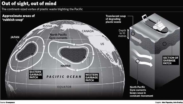
Increasingly, I am convinced that I am suffering from a learning disability that keeps me from knowing what is actually going on in the world around me.  This time, I somehow missed that there is a giant vortex of garbage (primarily plastic debris), bigger than the United States, swirling around in the Pacific.  Actually, it is two huge, linked garbage patches comprised of some 3.5 million tons of debris!  Occupying the North Pacific Gyre, it kills some 1million seabirds annually and some 100,000 sea mammals, according to the United Nations Environment Programme.  46,000 pieces of floating plastic per square mile.

I particularly like this list of debris captured in the middle of the Pacific Ocean, from an inflatable dingy:

  •  a drum of hazardous chemicals;
  •  an inflated volleyball, half covered in gooseneck barnacles;
  •  a plastic coat hanger with a swivel hook;
  •  a cathode-ray tube for a nineteen-inch TV;
  •  an inflated truck tire mounted on a steel rim;
  •  numerous plastic, and some glass, fishing floats;
  •  a gallon bleach bottle that was so brittle it crumbled in our hands; and
  •  a menacing medusa of tangled net lines and hawsers that we hung from the A-frame of our catamaran and named Polly P, for the polypropylene lines that made up its bulk.

And, given that plankton is one of the biggest building blocks of life on Earth, serving as the basis of our global food chain, I particularly like the notion that there is more plastic in the Pacific Ocean than plankton.

Even better, read this!

“Sadly, marine researcher Charles Moore at the Algalita Marina Research Foundation in Long Beach says there’s no practical fix for the problem. He has been studying the massive patch for the past 10 years, and said the debris is to the point where it would be nearly impossible to extract.”

It is to the point that there is http://www.greatgarbagepatch.org/.  You don’t even want to think about how this is getting back into your own foodchain.

And, I thought that all I had to solve for my children and their children was Global Warming!

I wonder which Agency has covered this in their briefing books for President Obama?  Somehow, I suspect that a swirl of plastic garbage 30 meters deep and 1500 miles wide has escaped everyone in Washington, D.C.

God help us.

Democracy from Space

DG_Mall

I figured this (geo)graphic from Digital Globe’s WorldView satellite was worth putting in oversized.

Thanks to my friend Jeff Kerridge from Digital Globe for getting me this image, even though he was in London for the DGI 2009 conference.  This shot came from the WorldView satellite with its panchromatic sensor.  Quickbird was not over DC at the time.

This shot must have been taken pretty early after dawn (I don’t have the acquisition time), as the Mall was packed to capacity before 11am.  I was on the parade route in front of the White House (thank you to the Gibbses for the tickets), in order to get picture of my nephew marching as part of the T.C. Williams JROTC.

As for my favorite part of the inauguration speech:

“As for our common defense, we reject as false the choice between our safety and our ideals. Our founding fathers … our found fathers, faced with perils we can scarcely imagine, drafted a charter to assure the rule of law and the rights of man, a charter expanded by the blood of generations. Those ideals still light the world, and we will not give them up for expedience’s sake. And so to all the other peoples and governments who are watching today, from the grandest capitals to the small village where my father was born: know that America is a friend of each nation and every man, woman, and child who seeks a future of peace and dignity, and that we are ready to lead once more.”

As for remote sensing, it will be interesting to see what the Obama Administration does about the BASIC satellite program.  Perhaps if they follow previous White House policy on remote sensing (sorry, the old White House website is gone as of noon yesterday, so I can’t yet find a link to it), they will launch more commercial satellites to meet the BASIC Tier 2 requirements.  In my opinion, this is one Bush Administration policy that should definitely carry over.  Frankly, just make it part of the Stimulus Plan!

Then, for the next inauguration, we will have better commercial satellite coverage.

Planet of Slumdog Millionaires

slums-full_Atlantic_750

(Geo)graphic extracted from an Atlantic article by Matthew Quirk, which strangely doesn’t mention Mike Davis.

Dave Kaplan put me onto the most astounding book, Planet of Slums by Mike Davis.  I think his quote was “You know, there is a slum that’s like 400 miles long on the coast of West Africa”.  More exactly, pages 5/6 will tell you

“Even more surprising is the vast West African conurbation rapidly coalescing along the Gulf of Guinea with Lagos (23 million people by 2015 according to one estimate) as its fulcrum.  By 2020, according to an OECD study, this network of 300 cities larger than 100,000 will “have a population comparable to the U.S. east coast, with five cities of over one million…[and] a total of more than 60 million inhabitants along a strip of land 600 kilometers long, running east to west between Bennin City and Accra”  Tragically, it will also be the biggest single footprint of urban poverty on earth.”

Conurbation.  I’m going to start using that one.

Perhaps the most disturbing was the discussion of the explosive growth of this area (twice that of the national population growth) during a consistent economic contraction.  This is definitely getting woven into my worldview on overpopulation, later.  But these slums are clearly also an incubator of political instability, terrorism, and networks of nefarious actors.  This book is something else.

Just in case you liked the (geo)graphic from my overpopulation blogpost, here’s one regarding slums using the same methodology, from the same source…enjoy.

188_750


Happy MLK Day!

UPDATE:   Slumdog Millionaire just got 10 Oscar nominations.

Who is Jarch Capital?

Great Land Grab_Africa_Agriculture


I had missed this one when it was published a few days ago in the Financial Times.

At first the idea of ex-Intelligence and State Department folks buying up a tract of Sudanese land the size of Dubai from warlords didn’t strike me as falling into the “what a great idea!” category.

But if you check out the Jarch Capital website and the (geo)graphic to the left, it seems like all these deals could actually bring some sort of economic development and stability to the region.  If only the graft and warlord culture don’t completely thwart them.

However, I am also reminded of Jared Diamond’s discussion of the ecological sources of the Rwanda genocide in his bookCollapse, and the link that Ban Ki-moon (United Nations Secretary General) has drawn between the environmental degradation, the symptoms of global warming, and the crisis in Darfur.  Even though a massive underground lake has been discovered underneath the Darfur region, it seems like the increasingly stressed Sudanese landscape will make it hard for this venture to succeed.

However, please note this prediction attributed to Jarch Capital’s Chairman, Phillippe Heilberg, in the FT article:

Mr Heilberg “believes that several African states, Sudan included, but possibly also Nigeria, Ethiopia and Somalia, are likely to break apart in the next few years, and that the political and legal risks he is taking will be amply rewarded.”

I wonder if that one is in a National Intelligence Estimate?  I’ll have to check!

Or, it could just mean more pirates

Africa In the Red

This (geo)graphic is Life Expectancy at Birth in Africa from 1960 – 2004 from UUorld Inc on Vimeo. My friend Willy Pell, the technology visionary behind UUorld Inc. (yes, www.world.com was taken), sent me the latest download of this supercool (and easy to use) application for loading and viewing (geo)statistical data.  I was perusing the videos that demonstrate the application in action, and found this scary visualization of the cratering life expectancy rate in Africa.  And, since the World Bank data in this demo ended in 2004, we can’t even watch the Darfur atrocities in overdrive. Speaking of Sudan, while the bubbling over of the Gaza situation is dominating the front page (now that the death toll has topped 900), Sudan is still getting column inches.  But I really loved this dynamic timeline of the conflict in Darfur, published by Reuters.  And, they have a nice map on the refugee camps over the border in Chad:

Darfur_Chad Border Refugee Camps Unfortunately, Reuter’s did not provide such a timeline for other countries around the world, to allow you to discover their reporting regarding different countries at any point in time.  Sorry, but this is a sore point of mine.  Why is it that news organizations can’t seem to publish their reporting to a map, so that I can quickly see how their reporting covers different parts of the world?  We’ve been able to do this (technically) for a long time.  Instead, I get to keyword search country name by country name.  Gee thanks.  I guess that I can pray for progress.

Speaking of praying, please read this article, which I found buried on the Reuters site:

Voodoo priests pray for Israel-Palestinian peace

Maybe Obama should have picked a Voodoo priest instead of Rick Warren for the Inaguration!

What Would Alexander Do?

MacedonEmpire_750


This (geo)graphic is another WWW orphan, but is the best cartographic representation I could find of Alexander the Great’s exploits.

As I read about the growing quagmire in Afghanistan, I find that journalists and opinionmakers offer different historical premises for their narratives.  For instance, that foreign powers have tried to conquer what is now Afghanistan for centuries, and that everyone since Alexander the Great has failed. (That is, it can’t be won, so don’t try.)  Or that Afghanistan is part of a strategically indefensible Central Asian landmass, which has seen would-be conquerors come and go for millennia, with the people’s occupying the Afghan wilderness persisting. (That is, you may conquer the territory, but the people will just wait you out until you leave, so why try in the first place.)

Actually, this wilderness has been invaded and settled by many – from the Persians, ancient Macedonians (Alexander the Great), and Indians (far before Christ or Muhammad walked the Earth, mind you) to the Ghaznavid Empire and the Mongols (Genghis Khan) – each with different motivations, different strategic considerations.  Just peruse this 29 part chronology of the powers that have sought or achieved control the territories in which modern Afghanistan resides.  Many have controlled this area for as long as the US has been around.

As for the notion that the Af/Pak border peoples have persisted despite the comings and goings of conquering armies, I need to dig for some  mitochondrial population genetics results to better understand the impacts of these invasions on the gene pool of the current day Afghans with whom we are engaged in armed conflict.  Somehow, I bet genetic anthropologists have not been wondering about the Af/Pak border over much of the past decade.

What I find most interesting is that there seems to have been a higher level of religious tolerance in the region in the past than current is exercised by the folks in the region today.  Commentators often talk about how the Taliban seek to take the country back to some medieval past.  If only they wished to take the region back to its ancient past, we would all be better off.

Avocados in the Levant

2005avocado_750

This (geo)graphic is another one of those orphaned pieces of World Wide Web data that is difficult to trace, but yet is still found on Wikipedia!

I was enjoying the cuisine at The Pita House in Old Towne Alexandria, VA today and had their avocado salad.  I didn’t even think about it when it was ordered, but when it showed up, I wondered whether my entire conception of the avocado’s natural history was wrong.  I thought it was of Mexico/Central American origins.  Could it be that it was, like citrus, of Meditteranean origins, transplanted to the New World by the Spanish?  Rather than interrupting lunch to search Wikipedia on my Blackberry (iPhone users, insert heckling here), I went all afternoon suffering from self-doubt.

First of all, the avocado salad was delicious.  I haven’t tried to replicate it yet, but I quickly did some  WWW forensic reconstruction of the dish based on similar recipes.  I will post an update once my wife and I (e.g., primarily my wife) have perfected it.  As best as I can tell, the ingredients are something like:

  •  2 Large Avocado — peeled and sliced into large chunks
  •  1/2 Cup green bell peppers – coarsely diced
  •  1/2 Cup tomatoes – coarsely diced
  •  1/2 Cup white onions –finely diced
  •  2 Tablespoons Olive Oil
  •  2 Tablespoons Lemon Juice
  •  Salt And Pepper — to taste
  •  2 Loaves Pita Bread – halved

Once I had the opportunity to consult Google, and the font of all knowledge returning the first link on nearly every topic – Wikipedia – I was able to confirm that indeed, the avocado did originate in current day Mexico/Central America.  That’s where the World Wide Web and/or the sad state of avocado scholarship began to fail me!  Let’s take, for instance, the following wikipedia paragraph.

P. americana, or the avocado, has a long history of being cultivated in Central and South America; a water jar shaped like an avocado, dating to A.D. 900, was discovered in the pre-Incan city of Chan Chan[1] though there is evidence of cultivation in Mexico for as long as 10,000 years.[2] The earliest known written account of the avocado in Europe is that of Martín Fernández de Enciso (c. 1470–c. 1528) in 1518 or 1519 in his book, Suma de Geografía que Trata de Todas las Partidas y Provincias del Mundo.[2][3] The first written record in English of the use of the word ‘avocado’ was by Hans Sloane in a 1696 index of Jamaican plants. The plant was introduced to Indonesia by 1750, Brazil in 1809, the Levant in 1908, and South Africa and Australia in the late 19th century.

Such precise dates!  This paragraph must be the totality of all knowledge on the subject since a pretty exhaustive search of the WWW turned up nothing other than links to Wikipedia entry, or outright plagiarism of this entry (other than this nice chronology which is restricted to the Spanish and American experience).

But, alas, the WWW fails me.  I can suppose that the avocado made it back to the Iberian peninsula near the time that Suma de Geografía que Trata de Todas las Partidas y Provincias del Mundo was published.  After that, its next destination was Indonesia?  Perhaps this is true, but the source that is used in the footnote (citation #2, which used to, but no longer exists at the end of the last sentence) offers a 404 Not Found, and is marked as an unreliable source.

So, I think that this is a pretty modern dish (as opposed to an age old, traditional Lebanese dish), if indeed the Wikipedia entry is correct in its assertion that avocados did not come to be cultivated in the Levant until 1908.  Hell, for all I know, the dish could be a really recent item by one of  Wolfgang Puck’s former Lebanese sou chef’s who runs a very popular restaurant in Beirut.

I would appreciate any intel that anyone has on how traditional this dish is.

BTW, the (geo)graphic of dubious origins (above) is a bubblemap – which apparently is a real cartographic “no-no”.  If you are interested in best practices in statistical cartography, you may want to read this entry.

BTW also, there is no bubble in Florida.  I believe this is a huge oversight.

UPDATE:  Oranges likely originated in SouthEast Asia, and weren’t introduced to the Mediterranean until around the 11th century…or something like that.  Though lemons originated in India, northern Burma and China, and were introduced to the Mediterranean in the first century A.D.   Wikipedia can’t help me out on limes but it looks similar to lemons. Grapefruit in Barbados.

Bring Peace to Palestine with Suisman’s Arc

Suisman ARC

This (geo)graphic was developed by Doug Suisman in a 2005 RAND Report.

As the crisis in Gaza transforms into a ground operation that is likely to be much more costly than the air strikes, someone needs to be thinking of the end game.  I am unconvinced that anyone is.  All we do know is that violence breeds more violence, and that this operation will make a new generation of Palestinians (and indeed Muslims worldwide) prone to anti-Israel and anti-Western violence – unless something very bold and different is done.  So, why don’t we try something new.  President-elect Obama should evaluate a 100% commitment to the immediate implementation of Doug Suisman’s Arc – the boldest land use planning exercise I have ever seen.

It is a concrete idea flowing from a study by the RAND Corporation’s Center for Middle East Public Policy, entitled “The Arc: A Formal Structure for a Palestinian State”.  The study was financed by 87 year old American property developer, Guilford Glazier, who remembered the transformational power of the Tennessee Valley Authority during the Great Depression.  Glazier wanted an answer to the challenge of how to accommodate the return of hundreds of thousands of refugees created by the 1948 war.

Suisman met that challenge, and more.  The study was not done with any timeline in mind (as the original research was done primarily during the second intifada).  Indeed, times have changed since then, and I believe that Suisman’s Arc proposal is ready made for the New Year.  A proposed Palestinian national infrastructure corridor linking Gaza and the West Bank, Suisman’s Arc offers a vision of a thriving Palestinian state inclusive of urban centers connected by a rapid rail line, a national water carrier, energy generation and transmission, telecommunications lines, and a national park system of parks, forests, reserves, and farmlands.  Palestinian’s have expressed great interest.  Who wouldn’t?

$40 billion price tag has been estimated, which I believe could quickly be raised from the US ($10B, Saudi Arabia $10B, India $5B, Israel $5B, EU $5B, China $5B – given the global recognition of the criticality of the Palestinian situation to a variety of global conflicts.  And, there’s even a video explaining the proposal on Suisman’s website (www.suisman.com)…which is much more than most policy proposals in Washington, DC can say for themselves.  The Milken Institute hosted a nice discussion on the topic.

I, like many, have been reading all of the reporting and commentary since the truce came to an end.  But, I find the entire dialogue completely unsatisfactory, as there is no affirmative vision for an end-game.  I don’t know that diplomats and security professionals can articulate a meaningful end-game without that which only a land use planner can bring.  “Design Meets Diplomacy” is the title of one Business Week article on the Arc proposal.  The title couldn’t be better.  Rather than having politicians and diplomats hammer out the sovereign state of Palestine, why don’t we focus on what it could look like after a peace accord is signed.

President-elect Obama could change the game forever by making Suisman’s Arc real.

Out of Africa

Map-of-human-migrations_750


This (geo)graphic is used all over, but I cannot find the source!  But, from its Wikipedia/Wikimedia page comes this key:

  • Numbers represent thousand years before present.
  • The blue line represents area covered in ice or tundra during the last great ice age.
  • The letters are the mitochondrial DNA haplogroups (pure motherly lineages); Haplogroups can be used to define genetic populations and are often geographically orientated.

Tonight I was watching a fantastic PBS/BBC documentary called “The Story of India”.  I highly recommend it.  The first episode focused on the period of 70,000-50,000 BCE, when the first humans migrated to the Indian subcontinent.  It revisited some of the genetic anthropology (or mitochondrial population genetics) work first introduced to me by Spencer Wells in the National Geographic video “Written in our DNA”.  I went fishing for a nice map that provided an overview of the early human migrations, and stumbled upon this one – though it seems to neglect the diaspora which populated Oceana and the subsequent Aryan migration into India.

In the India documentary, there was also a great discussion of the non-Indian origins of sanskrit.  (hint:  it didn’t come from Africa)  I will save that for another night.

UPDATE:  This is another nice map from a NYT article on the subject.

Boston Under Water

Boston Under Water


Geo(graphic) of Boston under a 5 meter sea level rise provided by Architecture 2030.

I recently asked my friends at CIESIN for a 1 and 2 meter sea level rise run on a high resolution digital elevation model so I could peruse my Florida ocean front real estate options.  Given the economic conditions down there, I’m looking to buy.  Scientific consensus has us about 1.5 meters down by 2100.  If I’m going to spend my hard earned money on beach front property, I want ensure that my great grandchildren are not under water.  I’ll get the data from CIESIN once the holidays are complete and post some prime ocean front real estate spots for the 2100-2200 AD/CE time frame, but in the meantime, I found a nice little report with some nice pics that validate my Florida concerns.

Unfortunately, the Florida pics aren’t as good as this Boston shot (above).  They didn’t include a 1.5 meter pic of Boston that was big enough for my blog.  I would have used that.  Instead, they went for the dramatic  5 meter model with the simple heading, “During the last interglacial period, 125,000 years ago, when the earth was this warm (2 °C to 3 °C warmer), sea level was four to six meters higher than today.”  Somehow, I don’t think (though I haven’t checked) that it is supposed to take 125,000 years to get back to this level.