Today’s Washington Post had a nice little article on dead zones. It made me go looking for a good map (see above for a bad map on the subject) of dead zones around the world. I love this very disturbing quote from the article:
“Daniel Conley, a professor at Sweden’s Lund University, noted that it would take up to 60,000 rail cars of liquid oxygen annually to directly re-oxygenate the sea. Lime or aluminum could also be dumped to provoke chemical reactions that would reduce nutrients, but that would be expensive and could have unintended ecological effects.”
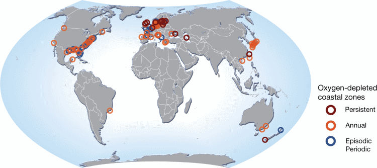
Nice. What strikes me is how good maps can be at communicating the cataclysmic nature of a single dead zone (see my earlier blogpost on the subject of the Gulf of Mexico Dead Zone), yet how bad they are at communicating the global scale and scope of the problem. I’m afraid red, orange and blue circles simply fail us. The map above simply does not strike me as a 60,000 rail car bad situation. And, having circles sized to represent the scale of the dead zones would simply show a bunch of blobs at a global scale.
I’m concerned that emerging global calamities simply cannot be conveyed cartographically, in a single global map. I am happy to be wrong on this, but I haven’t seen it. Unless we move to some other way of conveying the geographic extent, adjacency, and severity of such problems, it will be difficult to inspire collective action.