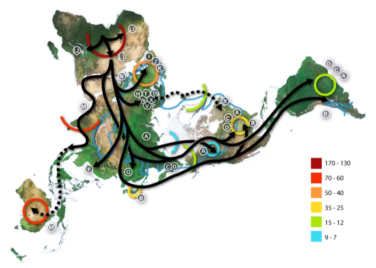
This (geo)graphic is used all over, but I cannot find the source! But, from its Wikipedia/Wikimedia page comes this key:
- Numbers represent thousand years before present.
- The blue line represents area covered in ice or tundra during the last great ice age.
- The letters are the mitochondrial DNA haplogroups (pure motherly lineages); Haplogroups can be used to define genetic populations and are often geographically orientated.
Tonight I was watching a fantastic PBS/BBC documentary called “The Story of India”. I highly recommend it. The first episode focused on the period of 70,000-50,000 BCE, when the first humans migrated to the Indian subcontinent. It revisited some of the genetic anthropology (or mitochondrial population genetics) work first introduced to me by Spencer Wells in the National Geographic video “Written in our DNA”. I went fishing for a nice map that provided an overview of the early human migrations, and stumbled upon this one – though it seems to neglect the diaspora which populated Oceana and the subsequent Aryan migration into India.
In the India documentary, there was also a great discussion of the non-Indian origins of sanskrit. (hint: it didn’t come from Africa) I will save that for another night.
UPDATE: This is another nice map from a NYT article on the subject.