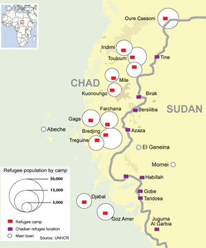
This (geo)graphic is Life Expectancy at Birth in Africa from 1960 – 2004 from UUorld Inc on Vimeo. My friend Willy Pell, the technology visionary behind UUorld Inc. (yes, www.world.com was taken), sent me the latest download of this supercool (and easy to use) application for loading and viewing (geo)statistical data. I was perusing the videos that demonstrate the application in action, and found this scary visualization of the cratering life expectancy rate in Africa. And, since the World Bank data in this demo ended in 2004, we can’t even watch the Darfur atrocities in overdrive. Speaking of Sudan, while the bubbling over of the Gaza situation is dominating the front page (now that the death toll has topped 900), Sudan is still getting column inches. But I really loved this dynamic timeline of the conflict in Darfur, published by Reuters. And, they have a nice map on the refugee camps over the border in Chad:
Unfortunately, Reuter’s did not provide such a timeline for other countries around the world, to allow you to discover their reporting regarding different countries at any point in time. Sorry, but this is a sore point of mine. Why is it that news organizations can’t seem to publish their reporting to a map, so that I can quickly see how their reporting covers different parts of the world? We’ve been able to do this (technically) for a long time. Instead, I get to keyword search country name by country name. Gee thanks. I guess that I can pray for progress.
Speaking of praying, please read this article, which I found buried on the Reuters site:
The blue line represents area covered in ice or tundra during the last great ice age.
The letters are the mitochondrial DNAhaplogroups (pure motherly lineages); Haplogroups can be used to define genetic populations and are often geographically orientated.
Tonight I was watching a fantastic PBS/BBC documentary called “The Story of India”. I highly recommend it. The first episode focused on the period of 70,000-50,000 BCE, when the first humans migrated to the Indian subcontinent. It revisited some of the genetic anthropology (or mitochondrialpopulation genetics) work first introduced to me by Spencer Wells in the National Geographic video “Written in our DNA”. I went fishing for a nice map that provided an overview of the early human migrations, and stumbled upon this one – though it seems to neglect the diaspora which populated Oceana and the subsequent Aryan migration into India.
In the India documentary, there was also a great discussion of the non-Indian origins of sanskrit. (hint: it didn’t come from Africa) I will save that for another night.
UPDATE: This is another nice map from a NYT article on the subject.
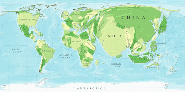
This (geo)graphic was found on The Encyclopedia of Earth, but sourced to the University of Michigan.
As energy prices went higher and higher over the past several years, and “peak oil” talk abounded, I found myself fond of saying “we don’t have an energy crisis, an environmental crisis, a water crisis, a food crisis, or whatever…we have a people crisis!” I still remember last Summer driving through New Delhi at night seeing thousands of people sitting together in small groups on the street curbs in the dark, just hanging out with friends. If every Indian burned as much electricity every evening as the average American (I have my big flatscreen, 2 computers, 2000 Christmas lights, houselights, and more running right now just for myself…oh dear!), I am pretty sure the Earth would instantaneously implode. You get my drift. I like this (geo)graphic because it inadvertently makes the earth look like it is going to burst from overpopulation.
Taken from the EoE site, “In this map the sizes of countries are proportional not to their actual landmass but instead to the number of people living there; a country with 20 million people, for instance, appears twice as large as a country with 10 million. (Source: University of Michigan)”
These days, I am continually driven to recollect a conference I helped with nearly 15 years ago as we were establishing the Earth Institute at Columbia University. One of the speakers was Joel Cohen discussing his book “How Many People Can the Earth Support?“. He outlined the choices and constraints that provide various answers to this question. I forget the high numbers in his spectrum, but I believe that 12 billion was not out of the question. But, I always saw his discussion of this topic as a bit too detached, and thought that it lacked an appreciation for the limited ability of renewable resources to renew themselves in the time horizons necessary to support the projected growth. In short, the book seemed to miss much of the fragility in the system. Personally, I adhere to a worldview that tracks more closely to Jared Diamond’s “Collapse“. We simply need an Earth with fewer people, as fast as we can manage it, through decreased fertility.
Jeffrey Sachs, the current Director of the Earth Institute, in his book the “End of Poverty” offered a more appetizing discussion on these matters than did Cohen (to be fair, Cohen may have evolved his line of argument over the past decade). In that book, he did a great job focusing on how to save human lives from malaria, tuberculosis, AIDS and the like, and to extricate a great mass of humanity in Highly Indebted Poor Countries (HIPCs) from its “poverty trap”. After focusing on eliminating the mesmerizing suffering (which does nothing for curbing population growth), Sachs did finally get to what I found to be a bit of a punchline. Women across the globe must be educated, employed, and in control of their lives. Only then will the birth rate will drop.
While I am squarely in support of alleviating suffering and eliminating extreme poverty, I think that serious action must be undertaken soon to break the gordian knot of norms, institutions, and taboos that prevent the education, free association (including the selection of mates), and workplace contribution of women. I am all for cultural diversity, and respecting the richness of human cultures across the globe. But, particularly if the solution to our spiralling “people crisis” (and all of its global impacts) is a change in how various cultures treat their women, then I believe that we need to get serious about encouraging cultures worldwide to tranform how they think of womankind.
Let’s see if Secretary of State nominee, Senator Clinton can get us started on this challenge.
 Unfortunately, Reuter’s did not provide such a timeline for other countries around the world, to allow you to discover their reporting regarding different countries at any point in time. Sorry, but this is a sore point of mine. Why is it that news organizations can’t seem to publish their reporting to a map, so that I can quickly see how their reporting covers different parts of the world? We’ve been able to do this (technically) for a long time. Instead, I get to keyword search country name by country name. Gee thanks. I guess that I can pray for progress.
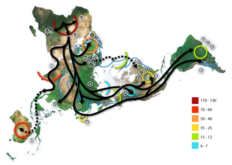